给大家带来的是Andoird基本UI控件中的RadioButton和Checkbox; 先说下本节要讲解的内容是:RadioButton和Checkbox的
1.基本用法
2.事件处理;
3.自定义点击效果;
4.改变文字与选择框的相对位置;
5.修改文字与选择框的距离
其实这两个控件有很多地方都是类似的,除了单选和多选,事件处理,其他的都是类似的! 另外还有一个ListView上Checkbox的错位的问题,我们会在ListView那一章对这个问题进行 解决,好的,开始本节内容~ 本节官方文档API:RadioButton;CheckBox;
1.基本用法与事件处理:
1)RadioButton(单选按钮)
如题单选按钮,就是只能够选中一个,所以我们需要把RadioButton放到RadioGroup按钮组中,从而实现 单选功能!先熟悉下如何使用RadioButton,一个简单的性别选择的例子: 另外我们可以为外层RadioGroup设置orientation属性然后设置RadioButton的排列方式,是竖直还是水平~
效果图:
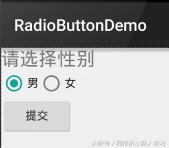

PS:另外有一点要切记,要为每个RadioButton添加一个id,不然单选功能会生效!!!
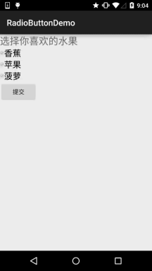
第二种方法是通过单击其他按钮获取选中单选按钮的值,当然我们也可以直接获取,这个看需求~
例子代码如下:
Button btnchange = (Button) findViewById(R.id.btnpost);
RadioGroup radgroup = (RadioGroup) findViewById(R.id.radioGroup);
//为radioGroup设置一个监听器:setOnCheckedChanged()
btnchange.setOnClickListener(new OnClickListener() {
@Override
public void onClick(View v) {
for (int i = 0; i < radgroup.getChildCount(); i++) {
RadioButton rd = (RadioButton) radgroup.getChildAt(i);
if (rd.isChecked()) {
Toast.makeText(getApplicationContext(), “点击提交按钮,获取你选择的是:” + rd.getText(), Toast.LENGTH_LONG).show();
break;
}
}
}
});
运行效果图:

实现代码:
public class MainActivity extends AppCompatActivity implements View.OnClickListener,CompoundButton.OnCheckedChangeListener{
private CheckBox cb_one;
private CheckBox cb_two;
private CheckBox cb_three;
private Button btn_send;
@Override
protected void onCreate(Bundle savedInstanceState) {
super.onCreate(savedInstanceState);
setContentView(R.layout.activity_main);
cb_one = (CheckBox) findViewById(R.id.cb_one);
cb_two = (CheckBox) findViewById(R.id.cb_two);
cb_three = (CheckBox) findViewById(R.id.cb_three);
btn_send = (Button) findViewById(R.id.btn_send);
cb_one.setOnCheckedChangeListener(this);
cb_two.setOnCheckedChangeListener(this);
cb_three.setOnCheckedChangeListener(this);
btn_send.setOnClickListener(this);
}
@Override
public void onCheckedChanged(CompoundButton compoundButton, boolean b) {
if(compoundButton.isChecked()) Toast.makeText(this,compoundButton.getText().toString(),Toast.LENGTH_SHORT).show();
}
@Override
public void onClick(View view) {
String choose = “”;
if(cb_one.isChecked())choose += cb_one.getText().toString() + “”;
if(cb_two.isChecked())choose += cb_two.getText().toString() + “”;
if(cb_three.isChecked())choose += cb_three.getText().toString() + “”;
Toast.makeText(this,choose,Toast.LENGTH_SHORT).show();
}
}
2.自定义点击效果
虽然5.0后的RadioButton和Checkbox都比旧版本稍微好看了点,但是对于我们来说 可能还是不喜欢或者需求,需要自己点击效果!实现起来很简单,先编写一个自定义 的selctor资源,设置选中与没选中时的切换图片~!
实现效果图如下:
PS:这里素材的原因,有点小…
<?xml version=”1.0″ encoding=”utf-8″?>
<selector xmlns:android=”http://schemas.android.com/apk/res/android”>
<item
android:state_enabled=”true”
android:state_checked=”true”
android:drawable=”@mipmap/ic_checkbox_checked”/>
<item
android:state_enabled=”true”
android:state_checked=”false”
android:drawable=”@mipmap/ic_checkbox_normal” />
</selector>
写好后,我们有两种方法设置,也可以说一种吧!你看看就知道了~
①android:button属性设置为上述的selctor
android:button=”@drawable/rad_btn_selctor”
②在style中定义一个属性,然后通过android style属性设置,先往style添加下述代码:
<style name=”MyCheckBox” parent=”@android:style/Widget.CompoundButton.CheckBox”>
<item name=”android:button”>@drawable/rad_btn_selctor</item>
</style>
然后布局那里:
style=”@style/MyCheckBox”
3.改变文字与选择框的相对位置
这个实现起来也很简单,还记得我们之前学TextView的时候用到的drawableXxx吗? 要控制选择框的位置,两部即可!设置:
Step 1. android:button=”@null”
Step 2. android:drawableTop=”@android:drawable/btn_radio”
当然我们可以把drawableXxx替换成自己喜欢的效果!
4.修改文字与选择框的距离
有时,我们可能需要调节文字与选择框之间的距离,让他们看起来稍微没那么挤,我们可以:
1.在XML代码中控制: 使用android:paddingXxx = “xxx” 来控制距离
2.在Java代码中,稍微好一点,动态计算paddingLeft!
示例代码如下:
rb.setButtonDrawable(R.drawable.rad_btn_selctor);
int rb_paddingLeft = getResources().getDrawable(R.mipmap.ic_checkbox_checked).getIntrinsicWidth()+5;
rb.setPadding(rb_paddingLeft, 0, 0, 0);
本节小结:
好的,关于RadioButton和Checkbox就讲到这里,如果有什么写得不对的,不好的,或者有好的建议欢迎指出 万分感激